logo simplified
14 Feb 2016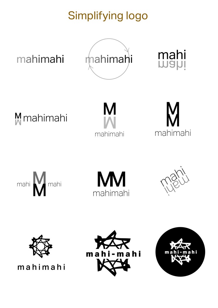 After designing a logo from our Nz motif pattern we have decided not to use our patterns for our logo but instead we wanted to describe our lamp’s characteristic using our logo.
I have started off as making a simple logo from the letter ‘M’ (standing for mahi=making)
and then because this logos on top looked like a clothing company label I have developed more.
After designing a logo from our Nz motif pattern we have decided not to use our patterns for our logo but instead we wanted to describe our lamp’s characteristic using our logo.
I have started off as making a simple logo from the letter ‘M’ (standing for mahi=making)
and then because this logos on top looked like a clothing company label I have developed more.
The last logo that I have created represents ‘simple’ but ‘fun’ aspect of our lamp. The circle is made out of the letter ‘M’ and it somehow looks like an open hand when It is in semi circle form so It relates to the name mahi-mahi (making-making)