luxolamp
06 Feb 2016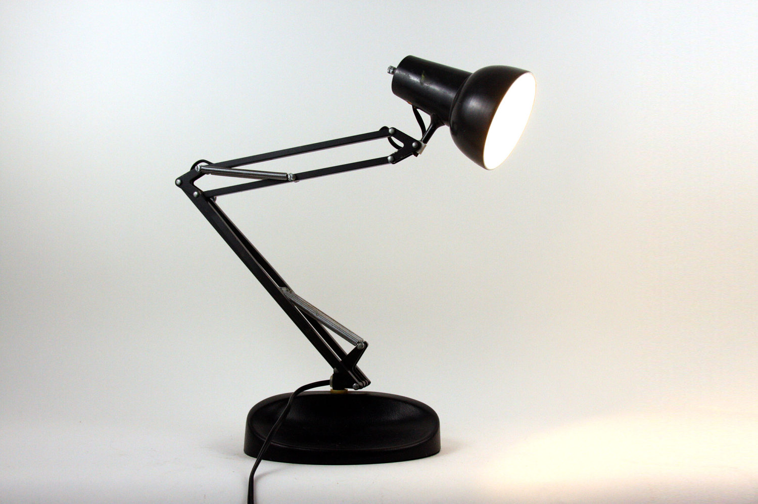
Our design comes from the luxo lamp, famously shown at the start of pixar films we will put our own wavy spin on it

Our design comes from the luxo lamp, famously shown at the start of pixar films we will put our own wavy spin on it
*experimenting with different curves and visual effects applicable to the design
synergy
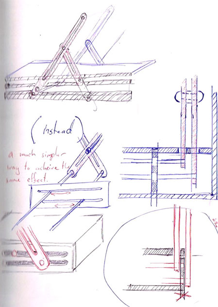 core concept of leg movement
Physical test of mechanics
testing apllication methods of panels to lamp section
3D draft to test mechanics of joints
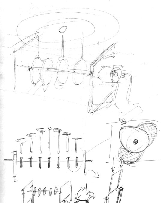 * Concept behind adaptions of Reuben Margolin’s Round wave.
###Aim to create a dynamic and modifyable ripple effect
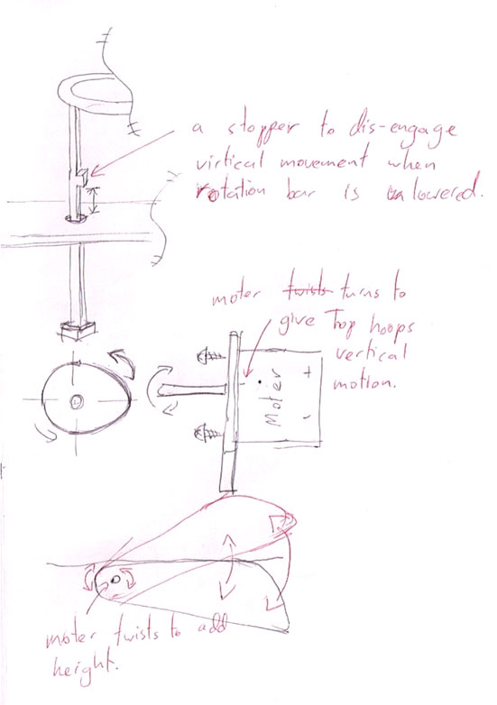 * this idea uses stoppers hitting a base level to provide a minimum height
* the rotation bar disengages from the rods when lowered.
* -Effect would be juttery when half engaged, with full range of movement rising into the kenitic movement instead of gradual change.
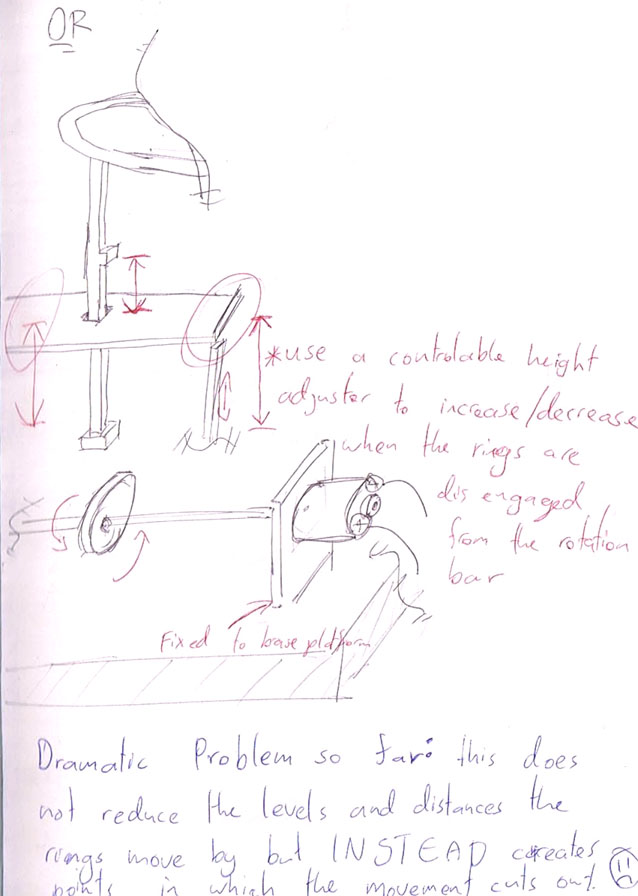 * Raises all bars to disengage the rotation bar.
* -This is not the desired effe3ct as more light would escape while it is disengaged.
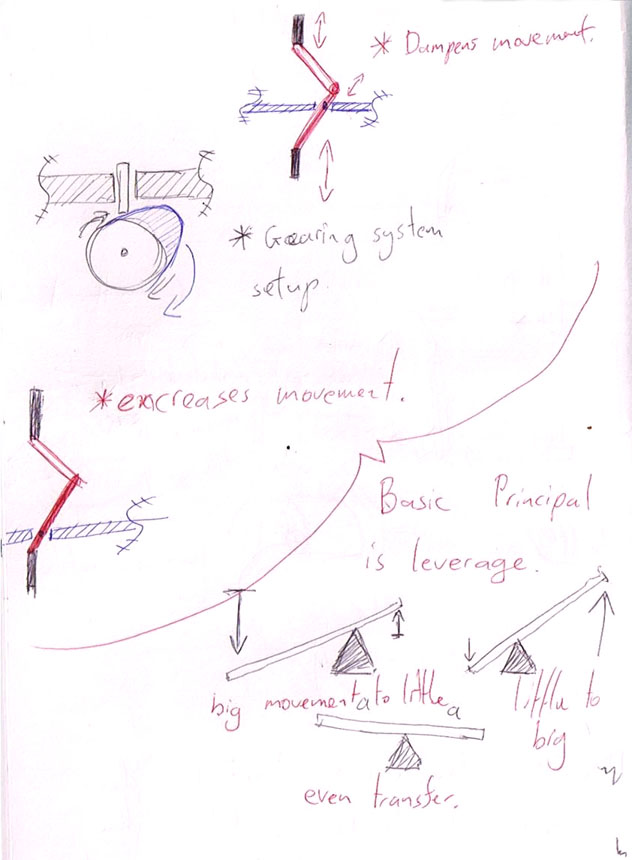 * Uses leverage to change the ratio of movement between the two sections of the arms.
* +would achieve the desired effect
* -would require three joints per arm, each ripple having two arms, a minimum of 18 joints.
* -would require a tall base to include full leghth required to use mechanic
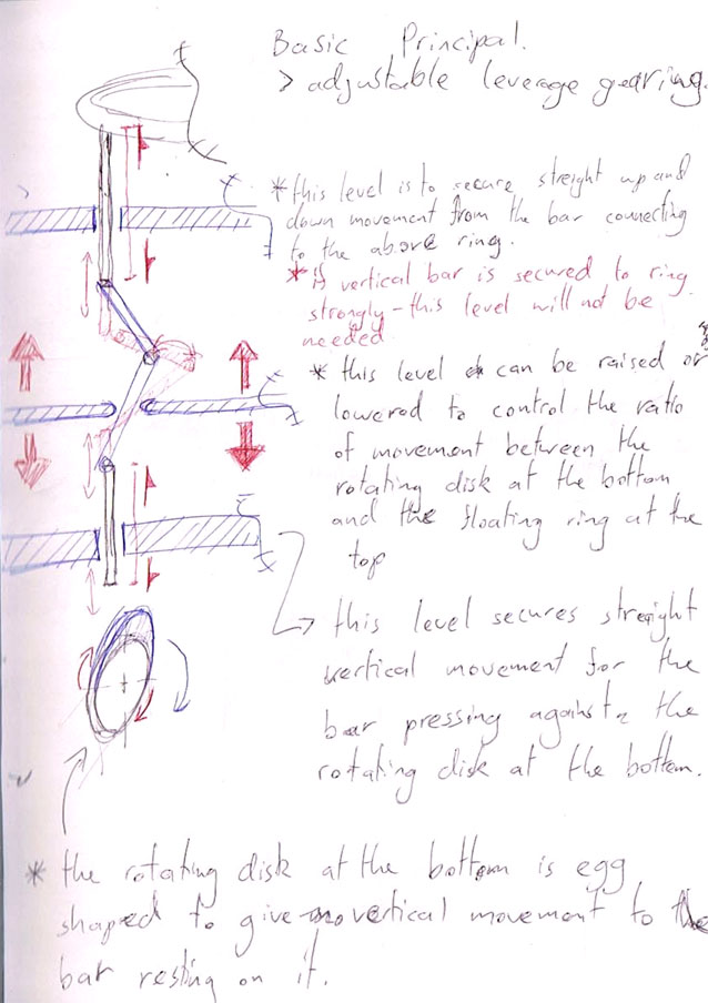 * a more in depth look in to how the mechanics would work in previous idea.
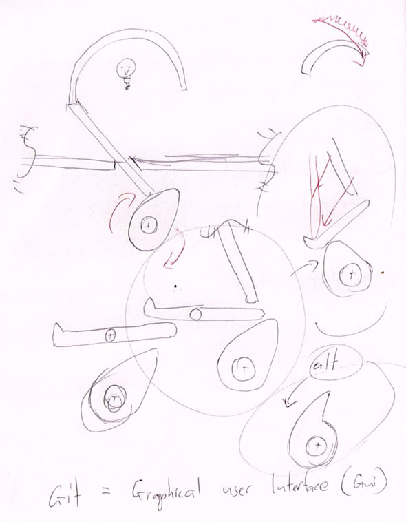 * two ways of acheiveing the same effect.
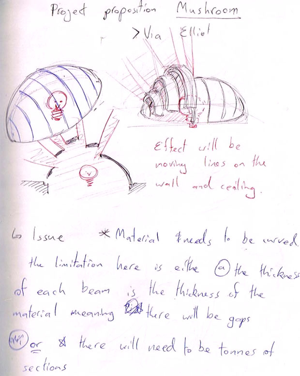 * Enclosure as proposed by Elliot
* Visually interesting.
* -May have limitations in prodution acheiving width as well as the curve
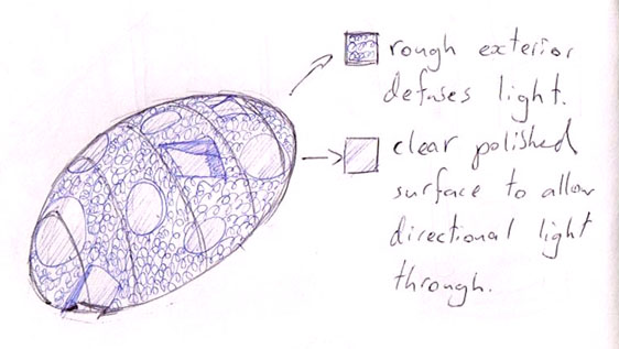 * same principal, using 3D# printed sections in clear arcrilic
* idea is to defuse the light on the body but pollish cicular secions to allow for directional light to pass trough creating more interesting silloettes.
* issues may arise when trying to polish or rough up surfeces
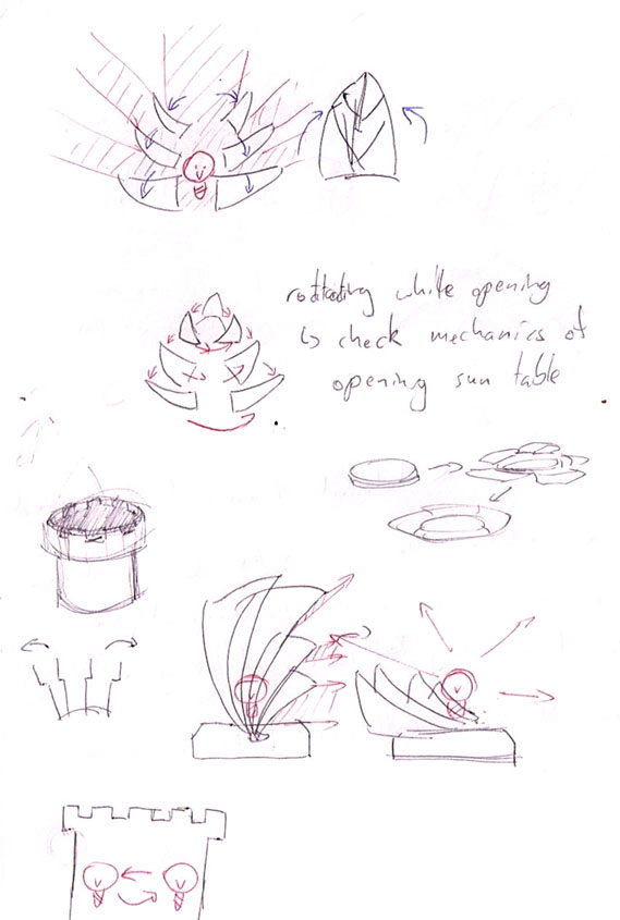 * Differnt shapes using the same principal of blocking out sections of light
* needs mechanics reimmagined to provide funtionality
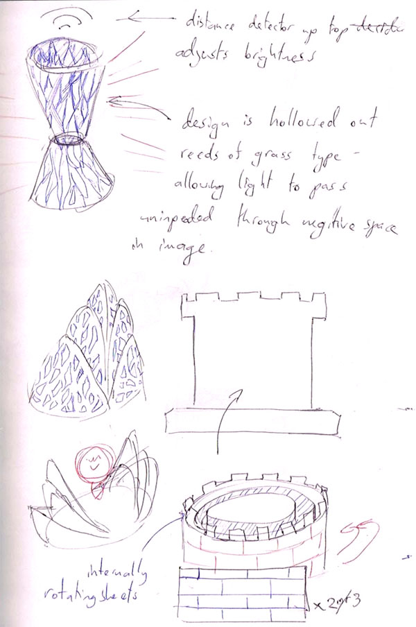 * Incorpirating the artist role models aethetic of holloweed out sections into the panels.
* +visually interesting and as panels overlap it would create very interesting effects.
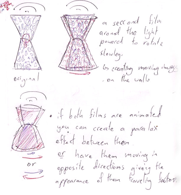 * a seccond layer of the original work to create moving silloettes on the walls.
* +visually interesting
* +well documented and easy to replicate
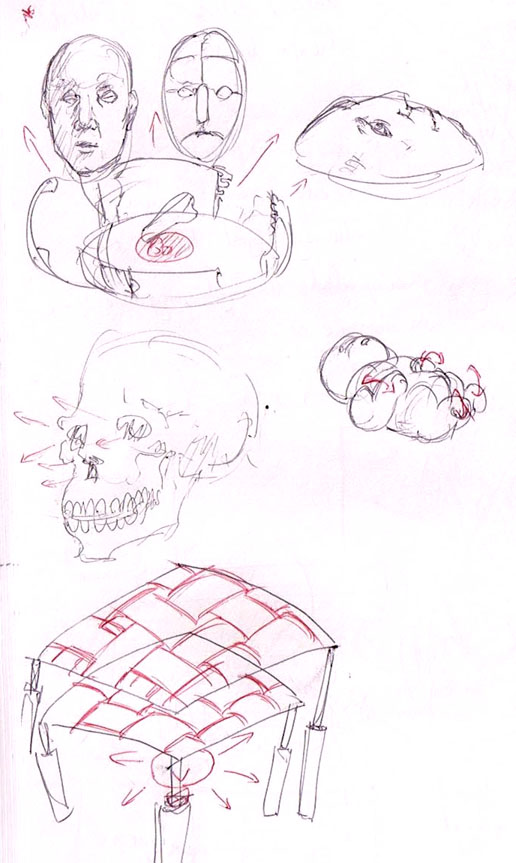 * experimenting with differnt shapes to block out the light
* +with the implamentation of material to create visual disrotions we are incorpriating another aspect of team Wave into the project.
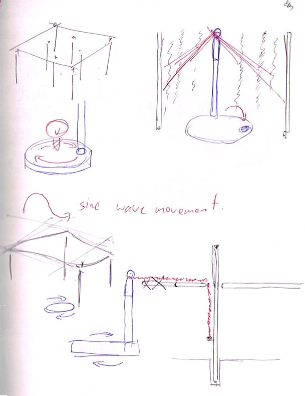 * floowing through with the idea of material in the project this concept uses the mechanics of Reuben Margolin’s Round wave
* +mechanic would work
* +Has a lot of room for devalopment
* -A lot of work for the project breif
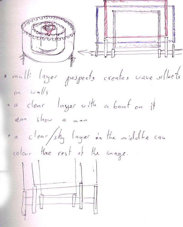 * Over lapping opaic waves aimed in creating a oceanainic imagery on the walls.
* +Has a clearly adetifyable audiance of parents
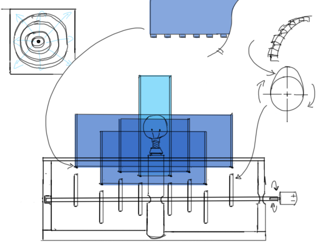 * a more indepth look into the mechanics of the wave form silloete
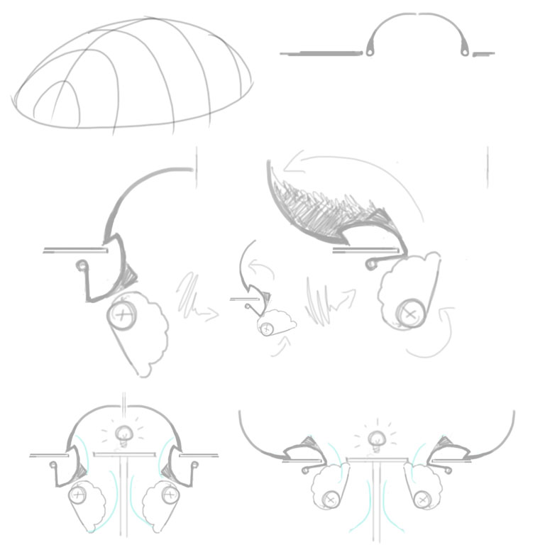 * a look into the mechanics which would enable uneven and controlable lift to each of the shell sigments.
* -If the outer edge of the shape is curved each of the shell sigments will lift in the exact same way leaving a big gap on the curve close to the rotating axis
* When talking to a mechanic he suggested the way around this would be to have a stepper curve on the axal like a gear box however there would be issues in attaching the sigments as well as having steps without making gaps between sections of the shell sigments
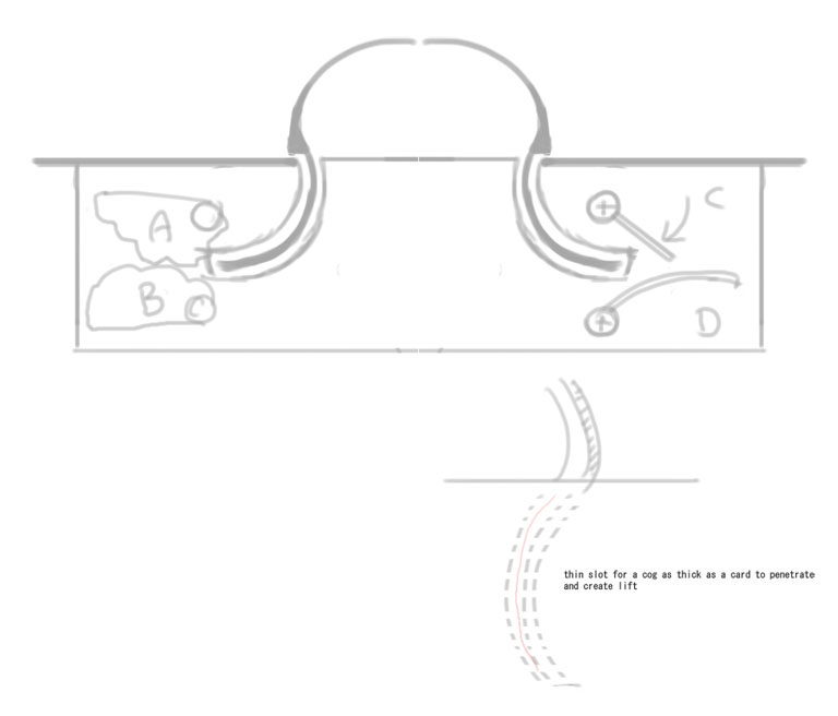 * this idea turns the shell sigments into peices you can slot into place, they are lifted by a card thickness leaver (A,B,C or D) through card sized openings in the middle of each hole.
* +this idea avoids the issues faces when having arms raise from the same rotating axis
* -this idea os complicated and there may be issues if the card leavers exit the card slots as they try to realign
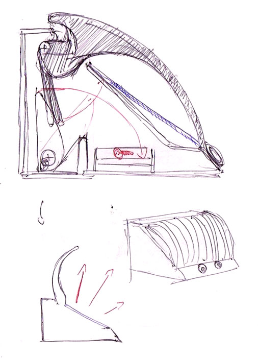 * Using the same concept as the original beatle design this would advoid all the problems of having a curved side rotating off a streight axis
* +would be simple and easy to make
* -Does not seem to reflect the artist role model and has no desernable use of the distance sensor
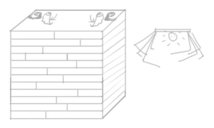 *a box idea would allow more light through gradually and could be more applicable as a light source.
*could be rotated onto a corner and animated functioning as a standing version of the artist role model
*-would be difficult to rotate more than three sides and the two sides next to the animated ones would ver visually unsatisfying next to the motion of the aother sides.
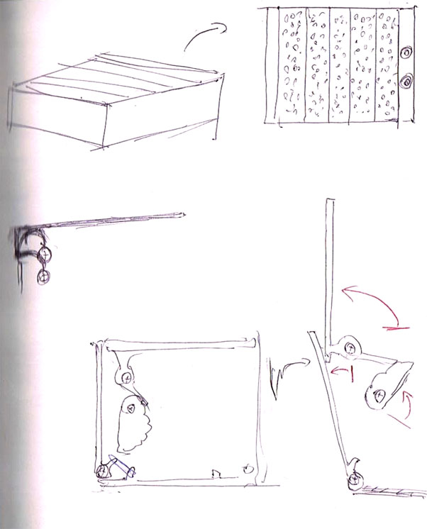 *the same concept as above but as a box on the ground, visually has a lot of potental and could have more than just one or two animated sections communicating with each other.
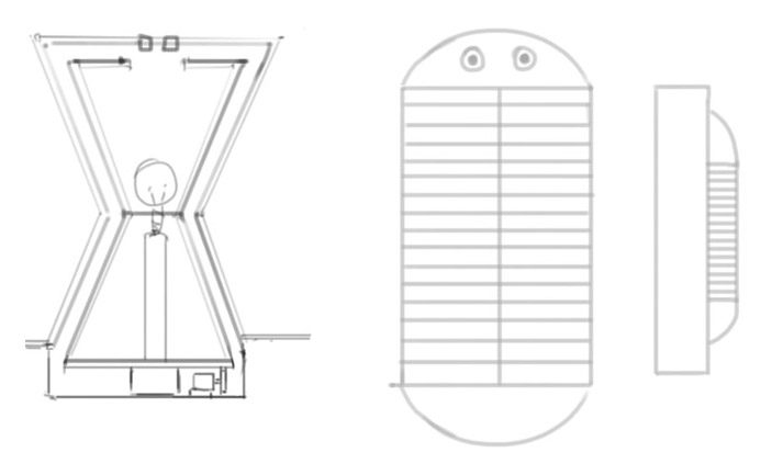 *referencing back to the artist role model and a simple devalopment which will avoid most of the problems that have become evident researching the beatle concept.
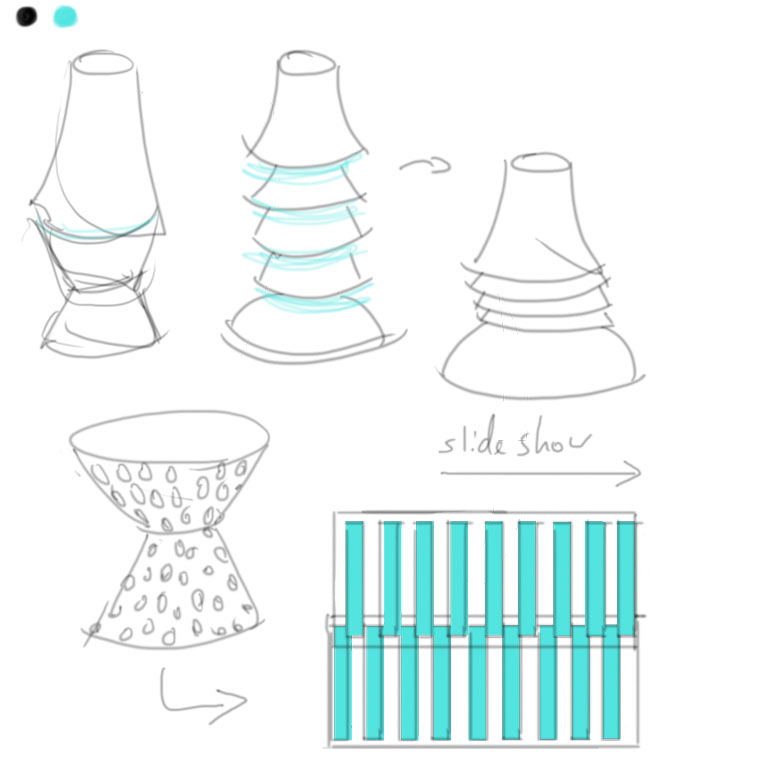 *A persuit of a simplar concept these are some basic concept of how to animate the orignial role models work
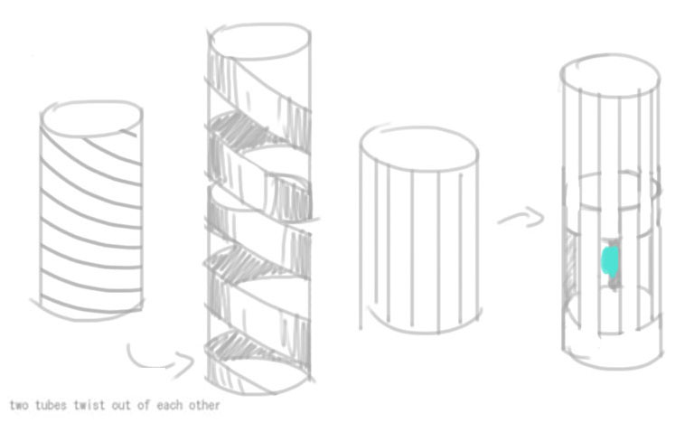
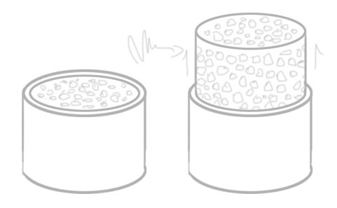
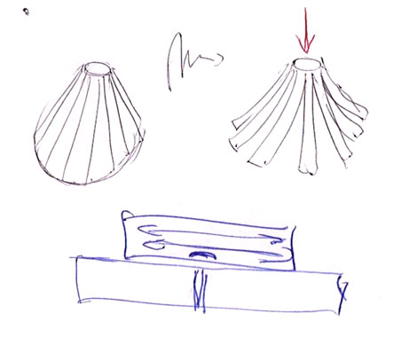 *a look into ways of manually restricting the flow of light
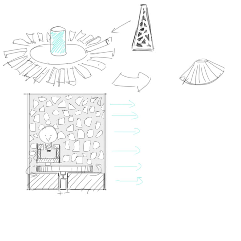 *through the movement of thet light itself interesting patterns as well as siloettes would be projected on the walls.
*The superior concept
*+works from the artist role model, adding new functionallity without changing the core features.
*+has a lot of possiblities in terms of aethetic with the large surface area of the legs and head